
Logo Design Case Study: Mirrorless Clicks

This case study dives into the design journey behind the fresh new brand identity for "Mirrorless Clicks," a photography service just getting started. My main goal was to craft a logo that's not just memorable, but also truly reflects the client's modern approach to photography and connects with their audience, even as they're still figuring out their specific niche.
Client Background: Mirrorless Clicks
Mirrorless Clicks is a brand new photography venture. The name itself, "Mirrorless Clicks," really highlights a modern focus, probably because they're all about using the latest tech and compact nature of mirrorless cameras.
Since they're new, Mirrorless Clicks is still in the early stages of figuring out their specialty. The client's big vision was to build a brand that feels professional, artistic, and offers a fresh take on capturing moments right from the get-go.
They needed a logo that would stand out in a busy market and show off their unique style, setting a strong foundation for future growth.
The Challenge
My main challenge was to design a logo that was:
Modern & Professional: Something that shows off the cutting-edge mirrorless camera tech while still feeling artistic and professional.
Memorable & Unique: We wanted it to really stand out from other photographers, steering clear of those common, generic camera aperture icons.
Versatile: It needed to work everywhere: from online portfolios and social media to print stuff and watermarks, ready to adapt as the business grows and finds its groove.
Discovery & Research
My process started off with a focused discovery chat with the client. We talked about their brand values, who they initially wanted to reach, what kind of look they liked, and what they felt made their photography special, even in its early days. Some key takeaways were:
A big focus on natural authentic moments.
A desire for a clean, simple, but still impactful design.
The importance of the "mirrorless" aspect, thinking about precision, technology, and a streamlined way of working.
I also explored what other photographers were doing with their logos to see what was common and where we could do something different. This research clearly showed I needed to move beyond the typical aperture icons and instead lean into the technology that inspired the brand's name.
Concept Development
Building on all those insights from our chats and research, I started developing themes to translate the brand's modern, precise, and artistic vibe into distinct visual concepts:
Technological Precision & Modern Optics: This theme explored the advanced side of mirrorless camera tech. I focused on elements like digital precision, sleek design, and the crystal-clear quality of modern lenses. The aim was a sophisticated, cutting-edge visual.
Dynamic Capture & Movement: Here, the ideas were all about capturing a moment, the fluidity of light, or the energy that's just part of photography. I used abstract shapes or lines to convey that sense of motion.
I created initial sketches and digital drafts for each theme, playing with geometric forms, smart use of negative space, and different ways to handle the text. Through a few rounds of feedback with the client, we refined these various concepts, which helped us narrow down the options and land on the final design.
Design Solution
The chosen logo for Mirrorless Clicks is a super clean, minimalist line-art representation of a mirrorless camera, perfectly capturing the essence of modern photography. The main part of the design is a sleek outline of a mirrorless DSLR, which immediately tells you what the client specializes in.
There's also a stylized 'S' tucked inside the camera's lens. This unique mark could hint at photography themes like "Shutter," "Sharpness," or just act as a memorable abstract element. It also plays on the iconography of Yin and Yang, conveying a sense of calmness and tranquility that reinforce the type of service the client operates
I developed the design in a few versatile versions so it works great across all sorts of media:
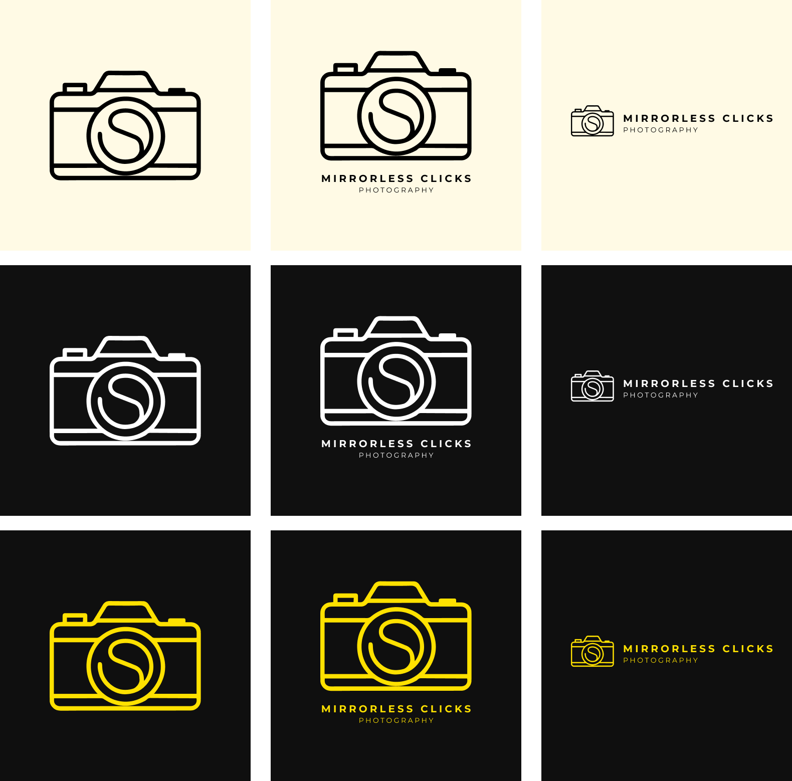
Icon Version: Just the camera icon with the 'S' inside. It's perfect for tiny spots like favicons, app icons, or social media profile pictures.
Square Aspect Ratio: This one has the camera icon sitting above the full "MIRRORLESS CLICKS" name, with "PHOTOGRAPHY" as a tagline below. It's ideal for profile pictures, print materials, or any square layout.
Landscape Aspect Ratio: Here, the camera icon is to the left of the "MIRRORLESS CLICKS" name and "PHOTOGRAPHY" tagline. This is optimized for things like website headers, banners, and other horizontal spaces.
The thinking behind this design was to:
Visually represent the "mirrorless" aspect with a clean, modern camera outline, avoiding anything too complex or old-fashioned.
Create a unique and memorable mark with that integrated 'S', making it stand out from generic camera icons.
Give the brand instant recognition and flexibility for all digital and print uses.
Deliver a timeless, professional look that matches the high quality of the client's photography.
Color Palette & Typography
The main color palette, as you can see in the versions, uses a sophisticated black for the logo lines and text, set against a clean, light cream/beige background.
Black: This color screams professionalism, elegance, and clarity, making sure everything is easy to read.
Light Cream/Beige: This provides a soft, welcoming, and modern backdrop that really lets the black elements shine.
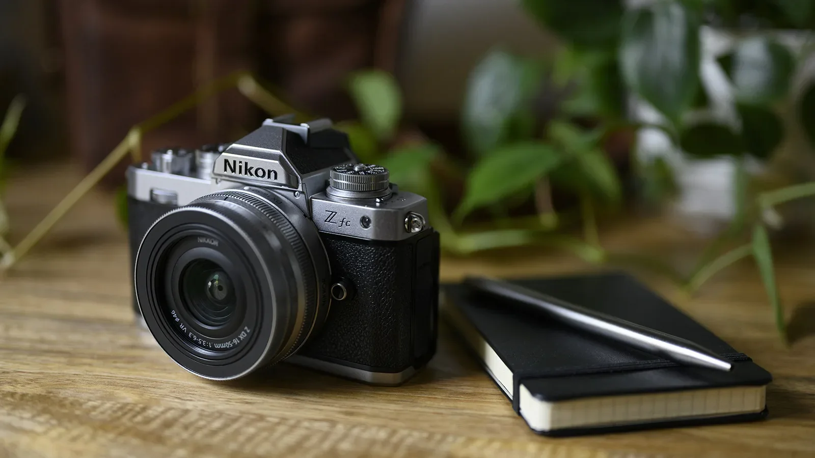
The client also explored a version that uses Nikon's brand colors. This could be an alternative palette or a subtle accent for certain uses, showing a nice connection to the client's preferred gear.

For the brand name, I went with a clean, sans-serif typeface. It makes "MIRRORLESS CLICKS" and "PHOTOGRAPHY" look modern and super legible. This choice ensures clarity everywhere and perfectly complements the logo's minimalist vibe.

Application & Mockups
I designed the logo to be super versatile, so it can be used smoothly across all the brand's touchpoints, including:
Their website and online portfolio
Social media profiles (using the icon and square versions)
Business cards and stationery
Watermarks on photos

Banner watermarks for non obstructive tagging

Obstructive full image watermarking
Having multiple aspect ratios means the logo always looks great and has impact, whether it's a tiny icon or a big feature on a website banner.
Conclusion
The new logo for Mirrorless Clicks successfully builds a modern, professional, and truly memorable brand identity. By cleverly balancing a sleek mirrorless camera representation with a unique integrated mark and flexible aspect ratios, the design perfectly communicates the client's cutting-edge approach to photography. This fresh visual identity sets Mirrorless Clicks up to attract their ideal clients and really grow their presence in the competitive photography market.
Ready to elevate your brand with a distinctive logo and identity? Get in touch to discuss how I can bring your vision to life.